Branding Soilmates
Huisstijl ontwerp voor Soilmates
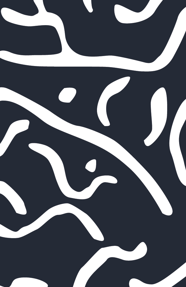
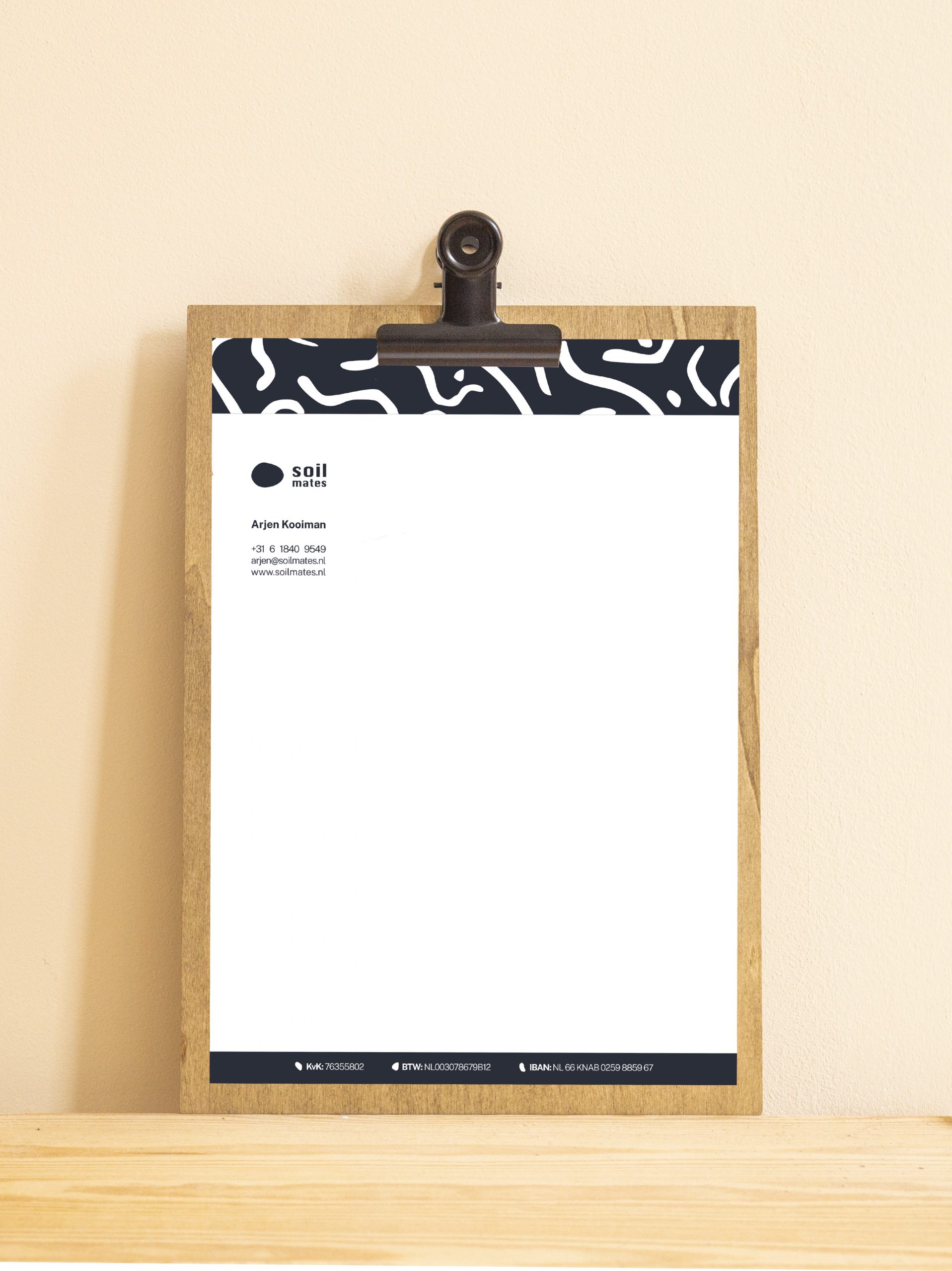
Natuurbelevingen en samenwerking. Daar staat het bedrijf Soilmates voor. Soilmates organiseert teambuilding activiteiten in een natuurlijke omgeving. Ik verzorgde de huisstijl. Gezonde grond leeft en is in beweging. Grond is de ondersteunende en voedende laag voor alles wat daarop groeit. Het evenwicht en diversiteit in de grond is te vergelijken met samenwerking in teamverband. Dit heb ik verwerkt in de huisstijl. Het resultaat is een strakke en stoere huisstijl met een stuk grond van bovenaf als logo. Ik heb een bijpassend patroon gemaakt van de vruchtbare (onzichtbare) laag van grond. De kleur is antraciet met een blauwe ondertoon. Dit geeft de huisstijl een strakke en moderne look & feel.
Branding design for Soilmates
Experience nature and team cooperation. That is what the company Soilmates stands for. Soilmates organises teambuilding activities in a natural environment. I took care of the branding. Healthy ground lives and is always in motion. Ground is the supporting and nourishing layer for everything that grows on it. The balance and diversity in the ground can be compared to working together. I have included this thought in the final design. The result is a sleek and tough design with a piece of land from bird’s eye view. I have made a suitable pattern of the fertile (invisible) layer of ground. The colour is anthracite with a blue undertone. This is what gives the branding design a sleek and modern look and feel.